How To Write A Monthly Performance Report
Updated by Xtensio
A monthly performance report helps managers and executives see how well a company is doing with specific jobs, projects, or goals. It allows them to evaluate current performance, set realistic targets, and identify areas needing improvement. Jump in and follow our simple, step-by-step guide and free template to create your monthly performance reports quickly and easily.
Xtensio is your team space for beautiful living documents.
Create, manage and share business collateral, easily.
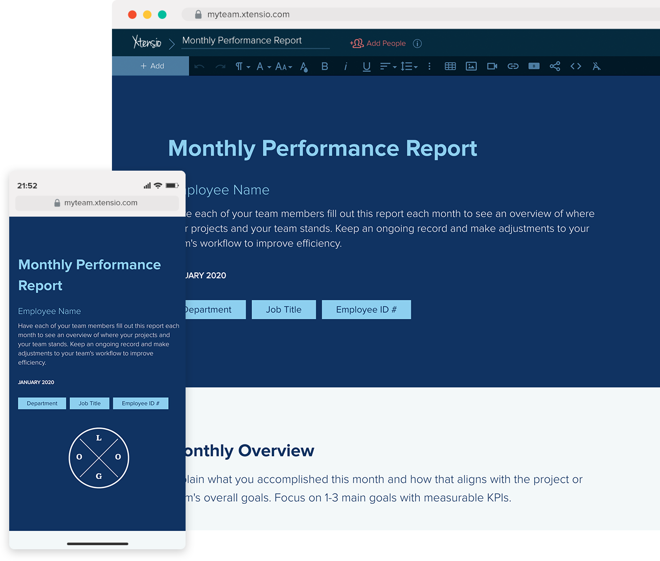
Table of Contents
Your guide to writing a monthly performance report
The monthly performance report helps you share achievements, update management on key decisions, and review strategic plans. Each team member fills out the report monthly to track performance and improve workflow.
Benefits:
- Identify areas needing improvement
- Monitor key business metrics across functions (operations, sales, finance, etc.)
- Evaluate team efficiency and set realistic goals.
Xtensio’s monthly performance report template makes tracking productivity, addressing roadblocks, and meeting deadlines simple. Keep your team aligned and efficient by using this report every month. Adjust workflows based on ongoing records to boost performance.
What Makes a Great Monthly Performance Report
A monthly performance report is more than a status update. It is a decision-making tool that tells leadership what happened, why it matters, and what comes next. The best reports answer three questions in under two minutes: Are we on track? Where are the risks? What do you need from me?
Most reports fail because they list activities instead of outcomes. Saying your team completed 47 tasks last month tells leadership nothing about impact. Saying your team reduced average ticket resolution time from 4.2 hours to 2.8 hours — a 33 percent improvement — tells a clear story.
Your audience determines the level of detail. A report for your direct manager can go deeper into tactical work. A report for the executive team should stay at the strategic level with one or two supporting data points per initiative. When in doubt, lead with the metric and attach the detail as a link.
Keep your performance report as a live link rather than a static file. When leadership opens it, they always see the current version — no outdated PDFs floating in email threads.
Choosing the Right KPIs for Your Report
The metrics you include should connect directly to your team’s goals for the quarter. If your team is focused on revenue growth, report pipeline generated, deals closed, and average deal size. If you are focused on operational efficiency, track cycle time, error rate, and cost per unit.
Every department has different KPIs that matter. Marketing teams typically report on traffic, leads, cost per lead, and marketing-qualified leads. Sales teams focus on pipeline value, win rate, average sales cycle, and quota attainment. Product teams track feature adoption, bug backlog, sprint velocity, and customer-reported issues.
Limit your report to five to eight KPIs. More than that dilutes the signal. For each KPI, show the current value, the target, the trend (up, down, flat), and a one-sentence explanation of what drove the change. This format lets readers scan quickly and dig deeper only where needed.
If a metric looks bad, explain it. Hiding underperformance erodes trust faster than the underperformance itself. State the number, explain the root cause, and describe what you are doing about it.
Common Performance Report Mistakes
The most frequent mistake is reporting on vanity metrics — numbers that look impressive but do not connect to business outcomes. Page views without conversion data, total emails sent without engagement rates, or headcount without productivity metrics all fall into this category.
Another common problem is inconsistent formatting. When each month’s report looks different, readers waste time figuring out the layout instead of absorbing the content. Use a reusable template in your workspace so the structure stays consistent month over month.
Avoid reports that are pure backward-looking. The best performance reports dedicate at least 20 percent of their space to forward-looking content: next month’s priorities, upcoming risks, and decisions that need leadership input. This shifts the report from a diary entry to a planning tool.
Finally, do not bury the lead. Your most important metric or insight should appear in the first paragraph, not on page three. Executives read top-down and may not scroll past the overview if it does not surface anything important.
How to Visualize Performance Data
Raw numbers are hard to process. A well-chosen chart makes the trend immediately obvious. Use line charts for metrics that change over time (monthly revenue, ticket volume), bar charts for comparisons across categories (performance by department), and RAG indicators (red, amber, green) for quick status checks.
Sparklines — tiny inline charts — work well in summary tables where space is tight. They show the trajectory of a metric at a glance without taking up a full chart’s worth of real estate. Most reporting tools and Xtensio templates support inline visual elements.
Keep charts clean. Remove gridlines, reduce colors to two or three, and label axes clearly. A chart that requires a legend, three footnotes, and a verbal explanation is a chart that failed. If you need to explain the visual, simplify it.
Pair every chart with a one-sentence insight. Do not make the reader interpret the data — tell them what it means. ‘Website traffic increased 18 percent month over month, driven primarily by the product launch blog post on March 12’ is far more useful than a standalone traffic graph.
1. Create an informative header
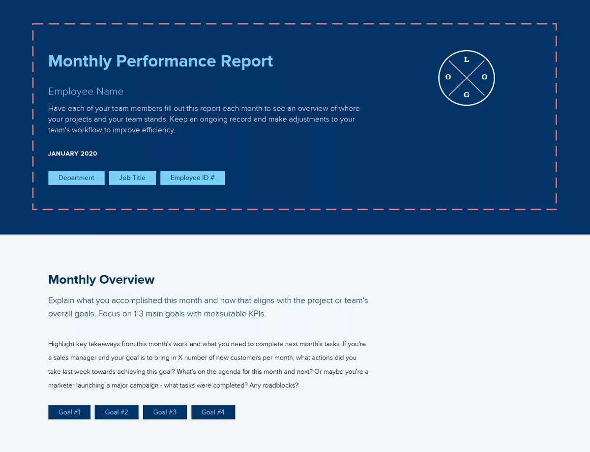
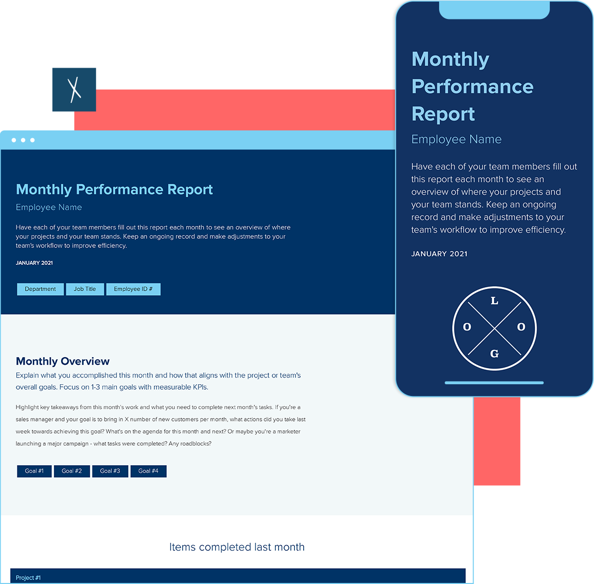
Start by adding your company name, logo, and the date along with the name of the person creating the plan. You can customize the color scheme and background to match your company branding.
Share the template with your team so each employee can use it for their monthly performance reports. Ensure they add their name, date, department, and employee ID number for easy reference by the leadership team.
Quick Tip: Sharing custom templates is simple. Update the instructional template to match your branding, click share, and select “save as a team template.” Your team will see the custom template on their dashboard and can easily copy it to create a new folio.
2. Give a high-level overview of your key accomplishments this month
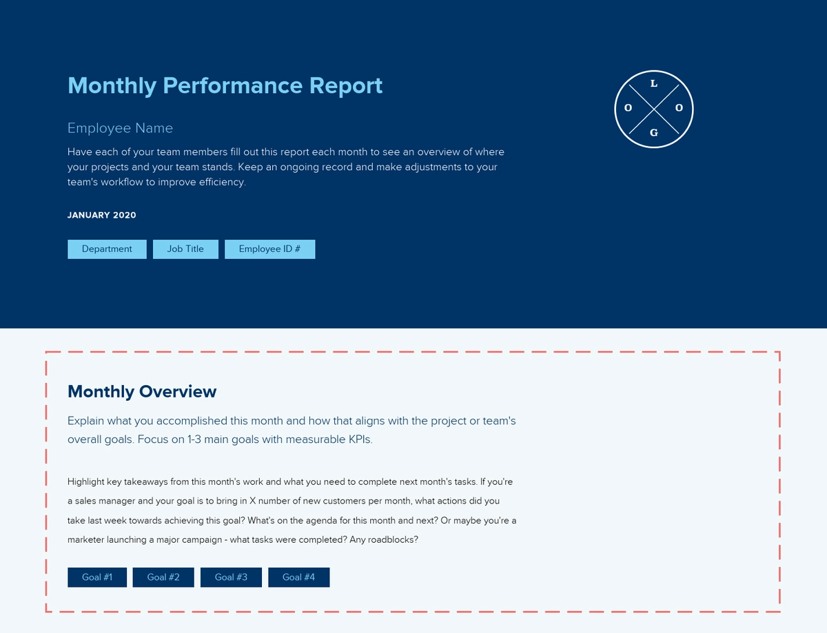
Summarize this month’s achievements and how they align with your team or project’s goals. Focus on 1-3 main objectives with measurable KPIs.
For example, if you’re a sales manager aiming to secure X new customers per month, detail actions taken last week, and plans for this and next month. If you’re a marketer launching a major campaign, outline completed tasks, encountered roadblocks, and upcoming actions. Tailor the overview to your specific role and goals.
3. Detail 2-3 key accomplishments from last month
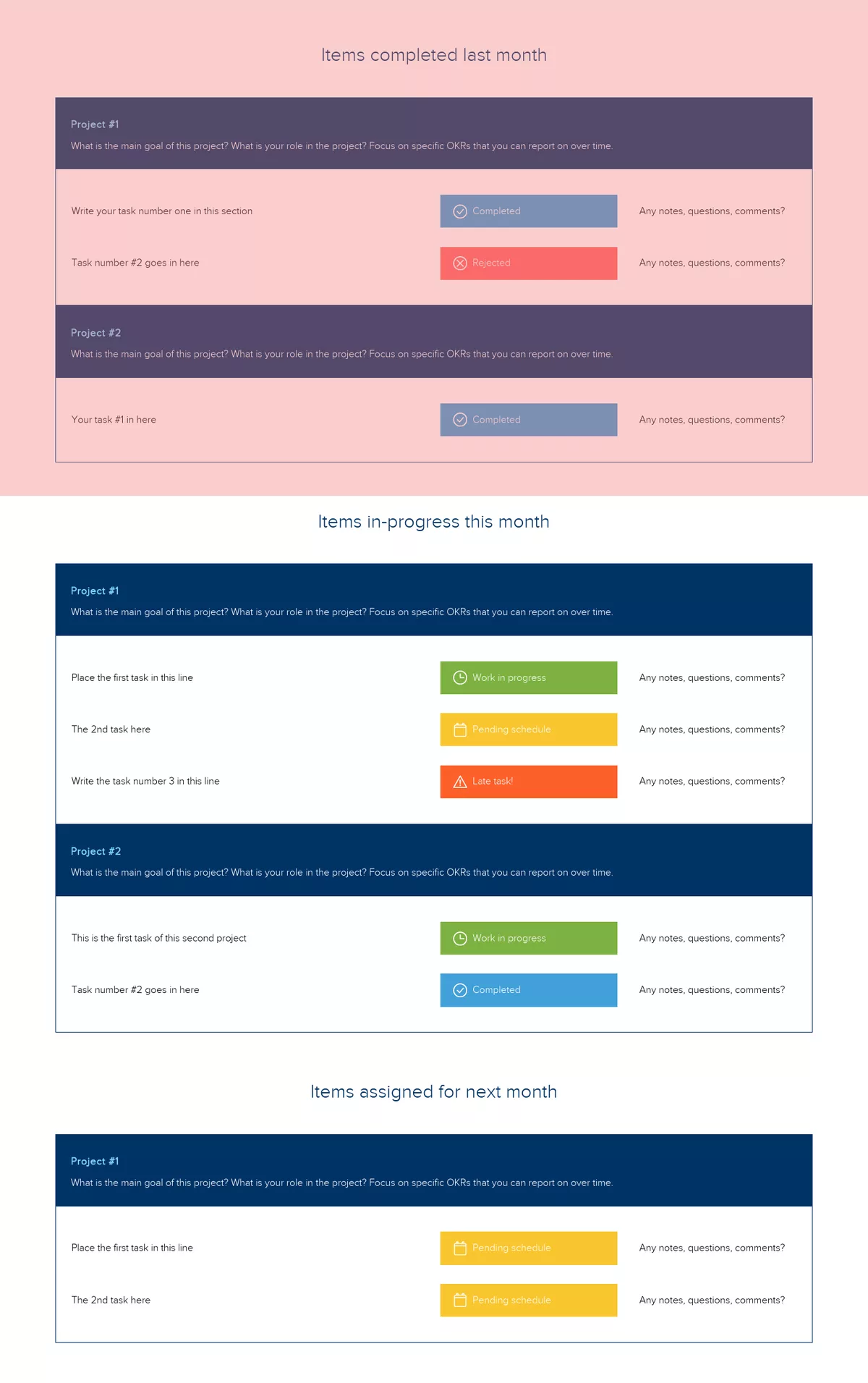
Reflect on the projects you worked on last month. What was each project’s main goal, and what role did you play? Provide details on your work, its status in the project pipeline, and any questions, comments, or roadblocks. Focus on specific OKRs (Objectives and Key Results) that you can track over time.
For example, describe progress on key initiatives, highlight any completed tasks, note any delays or issues encountered, and outline next steps to ensure alignment with overall goals.
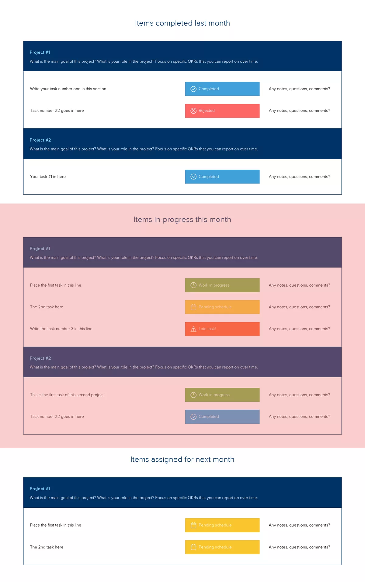
4. Outline projects and tasks in progress
When detailing your tasks for the month, keep your audience in mind. Highlight key projects and specific tasks you aim to complete. Note any questions or comments related to your tasks.
Include tables, graphs, and charts to present your data visually. This helps your manager quickly see trends and progress. For example, list your main projects, their current status, and any potential roadblocks. This clear, visual approach ensures your updates are easy to understand and actionable.
5. Identify future projects and tasks
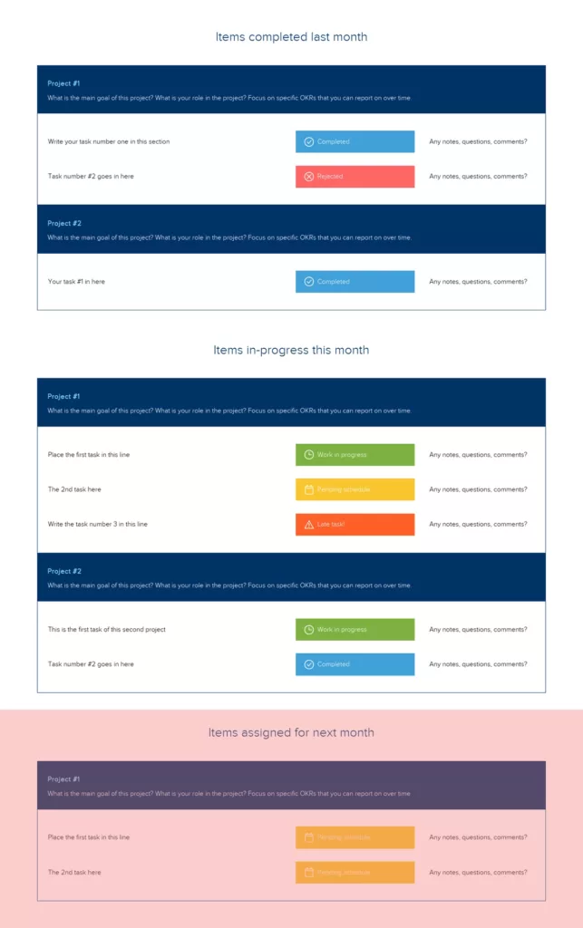
Share your plans for the upcoming month. What projects will you work on next? Outline the main goals and your role in these projects. This helps set clear expectations and ensures alignment with overall objectives.
For example, mention any new initiatives, upcoming deadlines, or anticipated challenges. A brief roadmap of future tasks keeps everyone informed and prepared for what’s ahead.
Share Your Monthly Performance Report
After completing your performance report with Xtensio, share it as a live link, export a PDF, or display it as a full-screen slideshow. Ensure it’s password protected if needed. Focus on what matters most to your team and regularly evaluate and improve the report format. Xtensio’s customizable templates can be repurposed and iterated to fit your evolving needs.
These guidelines help you craft a report that keeps everyone informed and aligned with team goals. Be creative, be productive!
Monthly Report vs Weekly Report vs Quarterly Review
A monthly performance report is a narrative about trajectory. A weekly report is a pulse check. A quarterly review is a strategic assessment. Each format serves a different audience and a different decision cycle, and confusing them is one of the most common reporting mistakes teams make.
Weekly reports should be short, typically under one page. They answer a single question: Is anything blocked right now? The audience is your immediate team and direct manager. Include completed tasks, tasks in progress, blockers, and next steps. Skip the data analysis. Weekly reports are operational, not analytical.
Monthly reports earn their value through trend analysis. One week of data is noise. Four weeks of data is a pattern. Your monthly report should show how key metrics moved over the past 30 days, explain what drove those changes, and forecast where the numbers are heading. The audience often includes leadership one or two levels above your direct manager. Keep tactical details minimal and focus on outcomes and impact.
Quarterly reviews go deeper still. They evaluate whether the team is on track to meet annual goals, assess resource allocation, and propose strategic adjustments. Quarterly reviews typically involve budget discussions, headcount planning, and goal recalibration. They require more preparation and longer presentations.
The biggest mistake teams make is writing a monthly report that reads like four weekly reports stapled together. If your monthly report is just a list of tasks organized by week, you have missed the point. Summarize the work, analyze the outcomes, and recommend what should change.
For teams that produce all three formats, keep your monthly performance report template separate from your weekly template. Different cadences deserve different structures. Build each as a reusable template in your workspace and clone it at the start of each period.
Monthly Report Structure by Team
Not all monthly reports should look the same. The KPIs, the narrative structure, and the level of technical detail depend entirely on which team is reporting. A marketing monthly report and a customer success monthly report serve different stakeholders and answer different questions.
Marketing teams should lead with pipeline contribution and revenue attribution, not vanity metrics. Structure the report around three areas: demand generation performance (MQLs, cost per lead, conversion rates by channel), content and brand performance (organic traffic trends, engagement rates, share of voice), and campaign-level results. Include a section on what is being tested this month and what was learned from last month’s experiments. Link to your engagement analytics to show which campaign assets are actually being viewed by prospects.
Sales teams need a report built around the pipeline. Start with quota attainment (team-level and individual), then cover pipeline health (total value, velocity, aging deals), and close with win/loss analysis. The most useful sales monthly reports include a short narrative on why deals were won or lost, not just the numbers. This pattern recognition is what helps leadership adjust strategy.
Product teams report differently because their work operates on longer cycles. Lead with adoption metrics for recently shipped features (usage rate, activation percentage, retention impact). Follow with engineering health indicators: sprint velocity, bug backlog trend, deployment frequency. Close with the roadmap status, specifically what shifted this month and why. Avoid feature-by-feature task lists. Instead, group updates by strategic initiative.
Customer success teams should structure reports around retention, expansion, and health. Start with net revenue retention and churn rate. Follow with NPS or CSAT trends. Then cover the health score distribution: how many accounts moved from green to yellow or yellow to red, and what drove those changes. Include a section on at-risk accounts with specific action plans.
Executive monthly reports operate at a different altitude entirely. They should fit on a single page or screen. Lead with the three to five company-level KPIs against targets. Follow with a brief narrative on the biggest win, the biggest risk, and the one decision that needs leadership input. Attach departmental details as linked appendices rather than including them inline. Executives who want to dig deeper can click through. Those who need the headline can get it in 30 seconds.
Regardless of your team, store your monthly report as a live link rather than a static PDF. When someone revisits it mid-quarter, they see the final version, not the draft you sent at 11 PM on the last day of the month.
5 Mistakes That Make Stakeholders Stop Reading Your Report
If your monthly performance report goes unread, the problem is almost never that people are too busy. The problem is that the report does not earn their attention. Here are the five patterns that cause stakeholders to stop opening your reports.
1. Leading with data instead of insight. A table of 40 metrics with no narrative is not a report. It is a spreadsheet. Stakeholders open your report to understand what happened and what it means, not to do their own analysis. Every data point you include should answer the question: so what? If you cannot articulate what a metric means for the business, remove it from the report.
2. Reporting vanity metrics as wins. Telling leadership that website traffic increased 23 percent sounds impressive until someone asks about conversion rates, which dropped. Vanity metrics erode credibility. Report metrics that connect directly to revenue, retention, or strategic goals. If a metric does not influence a decision, it does not belong in the report.
3. Missing context and benchmarks. Saying your team closed $420,000 in new business is meaningless without context. Was the target $500,000 or $350,000? Is this up or down from last month? How does it compare to the same month last year? Every metric needs a reference point. The report should make it impossible to misinterpret the numbers.
4. Burying the most important information. Your opening paragraph determines whether someone reads the rest. If the first thing a stakeholder sees is a project timeline or a task list, they will assume the report contains nothing urgent. Lead with the single most important takeaway. If revenue is ahead of plan, say that first. If a major risk emerged, surface it immediately. Treat the opening like a news headline.
5. Using a different format every month. When each report looks different, readers spend mental energy figuring out where things are instead of absorbing what you are saying. Consistency builds trust and saves time. Use a reusable template in Xtensio Workspaces so the layout, sections, and flow stay the same every month. Clone last month’s report, update the numbers and narrative, and publish. Your readers will know exactly where to find what they need.
How to Make Monthly Reports People Actually Read
The gap between a report that gets read and a report that gets ignored comes down to four practices that have nothing to do with the data itself.
Lead with the headline, not the methodology. Your first sentence should state the single most important thing that happened this month. Did revenue beat target? Did churn spike? Did a new product launch hit its activation goal? State it plainly. Then spend the rest of the report supporting that headline with evidence and context. This inverted-pyramid structure, borrowed from journalism, respects the reader’s time and front-loads the value.
Use visual hierarchy to guide scanning. Bold your key metrics. Use headers that contain the insight, not just the topic. “Revenue hit $1.2M, 8 percent above target” is a better section header than “Revenue Update.” Color-code status indicators: green for on track, yellow for needs attention, red for off track. When a stakeholder opens your report and can assess the overall picture in 10 seconds by scanning the colors and headers, you have designed the report correctly.
Write a “so what” for every metric. Do not present a number and leave it to the reader to interpret. After every chart or KPI, add one sentence that explains what the number means and what it implies for next month. For example: “Support ticket volume increased 14 percent month over month. This correlates with the billing system migration and is expected to normalize by mid-April.” That single sentence prevents three follow-up questions.
Turn the report into a living document. The most effective monthly reports are not static files sent once and forgotten. They are living documents that the team updates throughout the month as milestones are hit, risks emerge, or priorities shift. By the time the “due date” arrives, 80 percent of the report is already written because updates happened in real time. Share the report as a live link so stakeholders can check in anytime rather than waiting for a monthly email. This shifts the report from a retrospective chore to an active communication tool.
One final principle: send the report on the same day every month. Predictability builds the habit of reading. If your report arrives on the 3rd of every month, stakeholders will start looking for it. If it arrives randomly between the 2nd and the 10th, it gets lost in the noise. Pick a date, block the time, and treat it as a non-negotiable deadline.
Written by

Design, manage and share beautiful living documents… easily, together. Explore Xtensio
- Click and edit anything… together.
- Customize to match your branding.
- Share with a link, present, embed or download.
Monthly reports are the ultimate recurring deliverable. Build them in a deliverables workspace, share as live links, and clone the template each month. Track who actually reads the report with engagement analytics.

Create and deliver beautiful work, professionally.
Build, brand, and deliver living documents your clients actually engage with.







Join 409,687 professionals delivering work with Xtensio.
Related reports: Annual Report Template