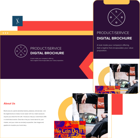
Digital Brochure Template
Use the digital brochure template to advertise brands, products, and services. Basically, it’s a digital version of your product catalog. Digital brochures have many key benefits that businesses can take advantage of to maximize leads, conversions, and brand awareness.
- Make updates in real-time to help your sales team sell better and stay informed.
- Share across all digital channels (email, social, forums, etc.). Your link is responsive and looks good on any device.
- Captivate customers with visually-engaging, interactive content that is easy to understand.
- Build a lead generation channel by adding CTA buttons to your digital brochures.
Xtensio is your team’s deliverables workspace.
Create, collaborate, and deliver client-ready docs—then keep them current.
Join 409,446 using Xtensio.
Xtensio is the workspace for professional deliverables.
Make one deliverable today—then build a repeatable system for every client and project.
This is where teams create, collaborate, organize, and deliver the documents that run their work.
Everything stays on-brand, current, and ready to share.

Organize every deliverable
Keep strategy, sales, marketing, and client docs together by workspace.
Create fast, stay consistent
Start from 200+ templates or AI drafts, then apply your brand kit.
Collaborate in the doc
No more “final_v7.pdf” loop.
Standardize across deliverables
Apply your brand kit + reusable modules so every deliverable matches.
Improve what you send
See engagement, iterate, and reuse what works across projects.
Create your brochure with Xtensio’s digital brochure template
- Create a free account and start editing, no credit card required.
- Customize everything to match your brand.
- Work together on the cloud.
- Share a link. Present a slideshow. Embed. Download a PDF/PNG
- Reuse and repurpose.

What is a digital brochure?
The digital business brochure is used to advertise brands, products and services. Unlike physical brochures, digital brochures are highly customizable per audience and optimizable for various digital mediums.
How do you make a digital brochure?
You can personalize your online brochure with Xtensio for digital link sharing, presentation, layout, color, file size to suit your goals. To design an engaging, digtally responsive brochure, follow these guidelines:
- Describe what your brand stands for, your mission and vision as concisely as possible. Make the content easy to skim by adding bullets, lists and headers.
- Detail product benefits, features and pricing.
- Use images and graphics to visualize your brand story, and background colors and images to define sections.
- Use the CTA button to make your calls to action guide readers toward taking the next step.
- Share the live, responsive link so you can update your sales team in real-time.
Digital Brochure vs PDF Brochure vs Print Brochure
The term “digital brochure” gets used loosely, and teams often treat PDFs, interactive web documents, and printed materials as interchangeable. They are not. Each format has distinct strengths, and choosing the wrong one costs you reach, engagement, and credibility.
PDF brochures are the most common “digital” format, and also the most limiting. A PDF is a static file: once you send it, you lose control. Recipients may forward an outdated version weeks later, and you have no visibility into whether anyone opened it, which pages they read, or whether they shared it. PDFs also break on mobile devices. A layout designed for a letter-size page gets compressed on a phone screen, making text unreadable without pinching and zooming. For quick internal documents where formatting control matters more than engagement, PDFs work fine. For sales materials, client deliverables, or anything meant to be shared externally, they create friction.
Interactive digital brochures shared as live links solve the distribution and updateability problems that PDFs create. When you publish a brochure as a live link, recipients always see the current version. Update pricing, swap a case study, add a new product line, and every link already shared automatically reflects the change. No re-sending, no version confusion. Live links also provide engagement data: you can see who opened the link, how long they spent on each section, and whether they clicked your CTA. For sales teams managing multiple prospects, this visibility changes how follow-up conversations happen. With Xtensio, every brochure you create lives at a live link that stays current and looks polished on any device.
Printed brochures still have a role, but that role is narrow. Physical materials work at trade shows, in retail environments, and in contexts where leaving something tangible signals investment in the relationship. The cost structure is fundamentally different: printed brochures require design, proofing, print runs (usually 500+ minimum for reasonable per-unit cost), shipping, and storage. Any change to the content means a full reprint. For organizations that update their offerings quarterly or faster, print inventory becomes waste. Most teams that still use print brochures also maintain a digital version as the primary distribution format, reserving print for specific in-person touchpoints.
The practical recommendation: start digital and use a format that supports live updates. Create your brochure in a workspace where your team can refine it together, publish it as a live link for external sharing, and only produce print copies for events or contexts where a physical leave-behind genuinely adds value.
Digital Brochure Design Best Practices
Design is the difference between a brochure that gets read and one that gets closed in three seconds. These practices are specific to digital brochures shared as live links or embedded on websites, where the reading experience is closer to a web page than a printed document.
Start with Mobile, Then Expand
Over half of shared links are first opened on a mobile device. If your brochure was designed only for desktop viewing, the first impression for most recipients will be broken layouts, tiny text, and horizontal scrolling. Design your brochure with a single-column mobile layout as the foundation. Content that works on a phone screen will always look acceptable on a larger screen. The reverse is not true. Test your brochure on at least three screen sizes (phone, tablet, laptop) before sharing it externally. If you are using a tool that automatically adapts layout to screen size, test it anyway. Automatic responsiveness handles structure, but you still need to verify that images, spacing, and text hierarchy look right at each breakpoint.
Establish a Clear Visual Hierarchy
Readers do not process a brochure linearly. They scan: headline first, then subheadings, then images, then pull quotes or bold text, then body copy. Your visual hierarchy should reward this behavior by ensuring the most important information is visible at each level of scanning depth. Use font size, weight, and color to create three clear levels: primary (headline, 24-32px), secondary (section headers, 18-20px), and body (14-16px). White space between sections signals that a new idea is starting. Crowded layouts, where every element competes for attention, result in readers absorbing nothing.
Use Interactive Elements Intentionally
Digital brochures can include embedded video, clickable links, expandable sections, and form fields. The mistake is using all of them. Each interactive element should serve a specific purpose: a 60-second explainer video replaces 300 words of product description, a “Request Demo” button captures intent at the moment of highest interest, an embedded testimonial video adds credibility that text cannot match. The test is simple: if removing the interactive element would not reduce understanding or engagement, remove it. Every element that does not earn its place adds loading time and cognitive friction.
Maintain Brand Consistency Across Every Version
When different team members create brochures independently, brand consistency erodes fast. Fonts drift, colors shift, logo placement varies, and the overall impression becomes “disorganized” rather than “professional.” The solution is to work from a shared template that locks your brand elements in place. Set your brand colors, fonts, and logo once, and every brochure your team creates inherits those settings. Xtensio’s workspaces let you establish brand controls so that even when multiple people contribute, the final output is visually cohesive. This matters most for organizations with distributed teams or external partners creating materials on your behalf.
5 Digital Brochure Mistakes That Kill Engagement
Most digital brochures fail not because of bad design but because of avoidable structural and distribution mistakes. These five errors are responsible for the majority of brochures that get opened but never read past the first screen.
1. Treating the Brochure Like a White Paper
A brochure is not a long-form content piece. Its job is to create enough interest for the recipient to take one next step: visit your site, book a call, share the link internally. When teams write 2,000+ words of body copy in a brochure, they are writing for themselves, not for the reader. The result is a document that looks dense, feels like homework, and gets skimmed at best. Target 300 to 500 words of body copy. Use visuals, bullet points, and bold text to carry the rest of the message. If you need more space for detail, link to supporting pages rather than adding more text to the brochure itself.
2. Ignoring Mobile Readers
If your brochure is a PDF designed for desktop viewing, anyone who opens it on a phone will have a poor experience. Text will be too small. Columns will overlap. CTAs will be too small to tap. The reader will close it and never return. This is not hypothetical: analytics from shared links consistently show 40 to 60 percent of first views happening on mobile devices. Publishing your brochure as a live link that adapts to any screen solves this problem without requiring you to maintain separate mobile and desktop versions.
3. Including Links That Break or Go Stale
A brochure with broken links signals neglect. If you link to a pricing page that has moved, a case study that was archived, or a form that expired, the reader’s trust drops immediately. When your brochure is a static PDF, link maintenance is impossible. When it is a live link, you can update links at any time and every recipient sees the fix immediately. Audit your brochure links quarterly at minimum. For brochures in active sales cycles, check links every time your website ships a major update.
4. Ending Without a Clear Next Step
Some brochures simply stop. The last section is a paragraph of text, and the reader has no idea what to do next. Every brochure needs to end with a visible, specific CTA: “Schedule a 15-minute demo,” “Get your free trial,” or “Contact our team at [email protected].” The CTA should be formatted as a button or a visually distinct element, not buried in a sentence. Position it after your strongest proof point or testimonial so the reader moves from “this looks credible” to “I should take the next step” in one smooth transition.
5. Sending a PDF When You Need a Live Link
The most common mistake is the most fundamental: attaching a PDF when the situation calls for a live document. PDFs cannot be updated after sending. They do not adapt to mobile. They provide no engagement data. They get saved in downloads folders and forgotten. A live link stays current as your business evolves, looks professional on any device, and tells you exactly who engaged with your content. The decision framework is straightforward: if you need the document to be a snapshot (a signed contract, a regulatory filing), use a PDF. If you need it to represent your current business (a sales brochure, a product overview, a client proposal), use a live link. For a deeper walkthrough of building your first brochure, see the digital brochure how-to guide.
Related to the Digital Brochure Template
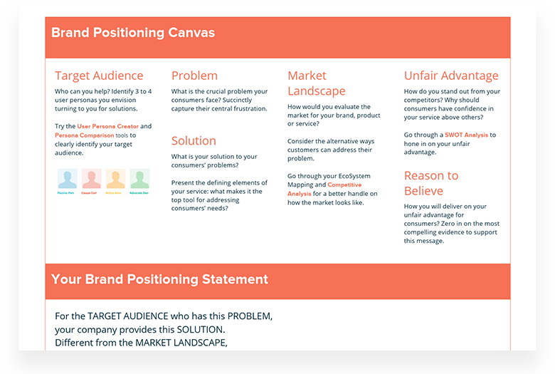
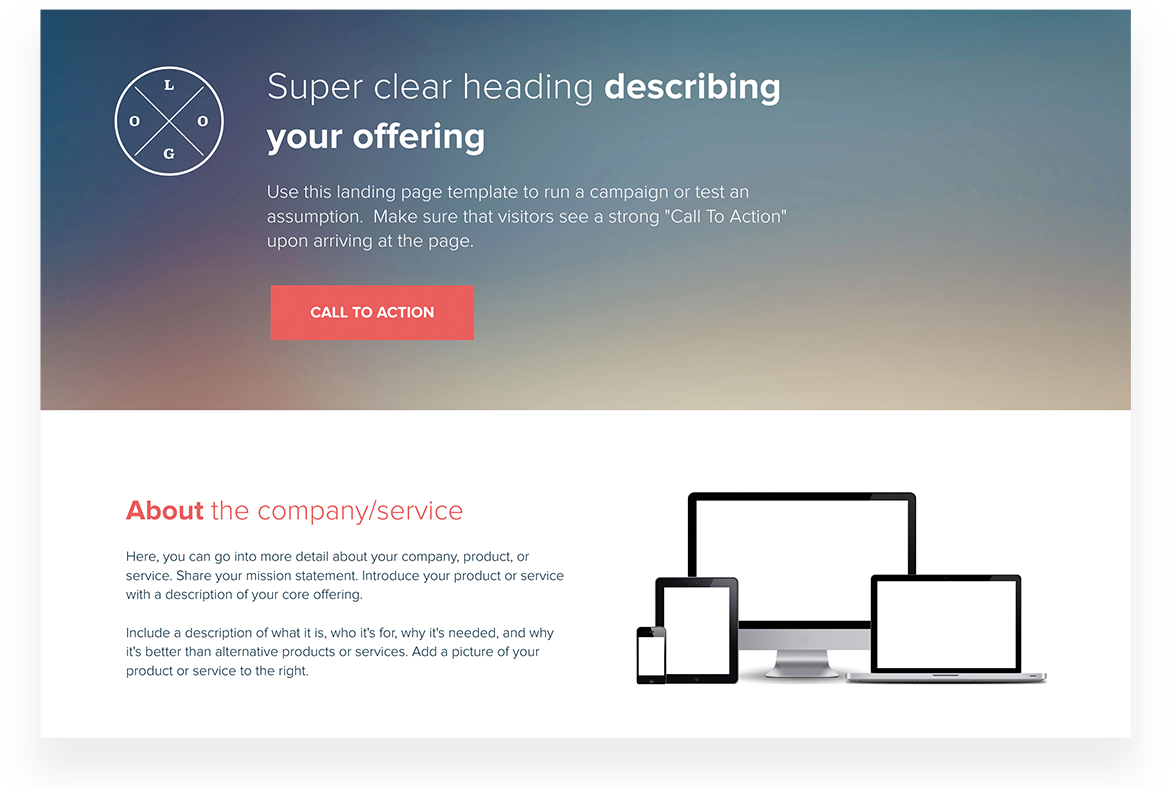
Fully customizable templates that you can make your own.


Types of Digital Brochures and When to Use Each
Not all digital brochures serve the same purpose. The right type depends on your audience, your goal, and where in the buyer journey the document will be shared.
Company Overview Brochure
A company overview brochure introduces your organization to someone who knows nothing about you — a new prospect, a conference lead, or a journalist. It covers who you are, what you do, who you serve, and why you exist. The goal is to produce enough understanding and interest to warrant a follow-up conversation, not to close a sale. Keep it high-level: your mission, key services or products, client types, and a clear next step (website, demo request, contact details).
Product or Service Brochure
A product brochure goes deeper on a specific offering — features, use cases, pricing tiers, and results. It is typically used later in the sales cycle, when a prospect is evaluating your product against alternatives and needs documentation to share internally. This brochure should address the most common objections and include social proof: customer quotes, case study references, or outcome metrics. A good rule for this format: every feature listed should be paired with a benefit, and every benefit should be grounded in a real use case.
Event or Campaign Brochure
Event brochures provide logistics and context for attendees, sponsors, or speakers: what the event is, who attends, the schedule, and what participation looks like. Campaign brochures support a specific marketing initiative — a product launch, a seasonal promotion, or a partnership announcement. Both are typically shorter than company or product brochures and have a defined expiration date. Digital formats are ideal here because they can be updated as event details change without requiring redistribution.
Investor or Fundraising Brochure
An investor brochure complements a pitch deck — it provides a behind-the-scenes look at the business for investors doing preliminary diligence. It covers traction, market size, team, and business model in a format that can be reviewed asynchronously. Unlike a pitch deck designed for a live presentation, a brochure must stand alone without narration. Every claim needs a number or a source. The visual design should signal professionalism and attention to detail, since investors are partly assessing execution quality.
Internal Communications Brochure
Not every brochure is meant for prospects or investors. Internal brochures serve HR teams announcing new benefits, operations teams rolling out new processes, or leadership teams communicating strategy shifts. The audience is employees, not customers, and the design priorities shift accordingly: clarity and completeness matter more than persuasion and polish. Internal brochures benefit most from the live link format because organizational information changes frequently. A benefits overview published as a live link can be updated during open enrollment without redistributing a new PDF to every employee. A process document shared as a live link ensures that the team on the ground floor in Tokyo is working from the same version as the headquarters team in New York.
Regardless of the brochure type, the format choice has the largest impact on long-term effectiveness. A brochure shared as a static PDF becomes outdated the moment your business changes. A brochure published as a live link stays current without requiring anyone to re-send or re-download. For a concise data-focused alternative to a full brochure, see the fact sheet template.
How to Structure a Digital Brochure
The structure of your brochure determines how much of it gets read. Most readers follow a predictable scan pattern: they read the headline, look at visuals, scan subheadings, and then decide whether to read the body text. A brochure structure that works with this behavior — rather than against it — communicates its key message even to readers who spend only 30 seconds on it.
Cover: One Headline, One Visual, One CTA
The cover should answer three questions in under five seconds: who is this for, what do they get, and what should they do next? Avoid putting your company name as the headline — most readers do not know or care who you are yet. Lead with the outcome or the problem you solve. “Cut client reporting time from 4 hours to 20 minutes” is a better cover headline than “Xtensio — The Leading Deliverables Platform.” The visual should reinforce the headline, not compete with it.
Middle: Proof, Not Features
The middle section of a brochure is where most companies go wrong by listing features instead of evidence. A feature tells readers what your product does. Proof shows them it works. Replace “AI-powered content generation” (feature) with “Teams produce proposals 3x faster with Xtensio’s AI workspace” (proof). Use customer quotes, outcome statistics, case study references, and named client logos. Anything that requires the reader to trust you should be backed by evidence that makes that trust reasonable.
Keep the middle section scannable: short paragraphs under four lines, one idea per paragraph, bullet points for lists of three or more items. Use subheadings for every distinct section. A reader who only reads the subheadings should still understand the document’s core argument.
End: One Action
End the brochure with a single, clear action. The closing section should include your contact information, a primary CTA button or link, and — if relevant — a secondary proof point like a client logo strip or an awards badge. Do not add more selling at the end; by this point, the reader has decided whether they are interested. Make it as easy as possible to take the next step.
Distributing Your Digital Brochure
How you distribute your brochure matters as much as how you design it. A well-designed document that reaches the wrong people or in the wrong format produces no results. Here are the most effective distribution approaches for digital brochures:
- Direct outreach (sales sequences). A link to your brochure in an email or LinkedIn message works better than an attachment — links are less likely to trigger spam filters, and you know when recipients click them. Send the link at the point in a sales conversation when a prospect asks “can you send me something to share internally?” — this is the moment it will actually be read.
- Website resource page or contact form follow-up. Embed your brochure on a dedicated landing page or include it in your automated follow-up email sequence after someone fills out a contact form. This ensures everyone who expresses intent has access to supporting materials without a sales rep having to send it manually each time.
- Event follow-up. After a trade show, conference, or networking event, your brochure serves as a digital leave-behind. Send a short follow-up message with the link within 24 hours of meeting someone. At this point, the contact remembers you, and the brochure reinforces the conversation rather than starting a cold pitch.
- Partner and reseller enablement. If partners or resellers sell on your behalf, a centrally hosted brochure that they link to — rather than a PDF they download and distribute — ensures they always have your current messaging. Update the brochure once and every partner automatically shares the current version.
Teams use Xtensio to create, share, and improve professional deliverables.
Trusted by 409,446 teams, founders, and consultants.



Jeff Schenck
Marketing Manager @

David Nason

Grace Ghunaim
Global Chief Strategy Officer (CSO) @

Ben Cary
Founder @

Leon Coe
Instructor @
Texas A&M University

Jennifer Alt
UI/UX Designer @

Zac Heisey
Director of Digital Marketing @

Jenny Johansson
UX Manager @

Ryan Dobson
Global Engineering Manager @

Create and deliver beautiful work, professionally.
Build, brand, and deliver living documents your clients actually engage with.




Join 409,446 professionals delivering work with Xtensio.